The magic of imperfect texture in kids books illustration
Charming smudges and wonky lines
Hi everyone!
Last week I had the privilege of attending the Bologna Children’s Book Fair, and I’d like to share a big takeaway with you. It’s about the art I got to see at the Illustrator’s Exhibition. This exhibition features the work of dozens of artists from around the world.
I enjoyed the art show so much that I bought the nearly 200 page catalog. A variety styles were showcased, although the styles were different, there was a common theme of a sort of organic looseness in the lines and coloring styles. There was so much texture, and nothing was entirely perfect. For example, look at this piece:
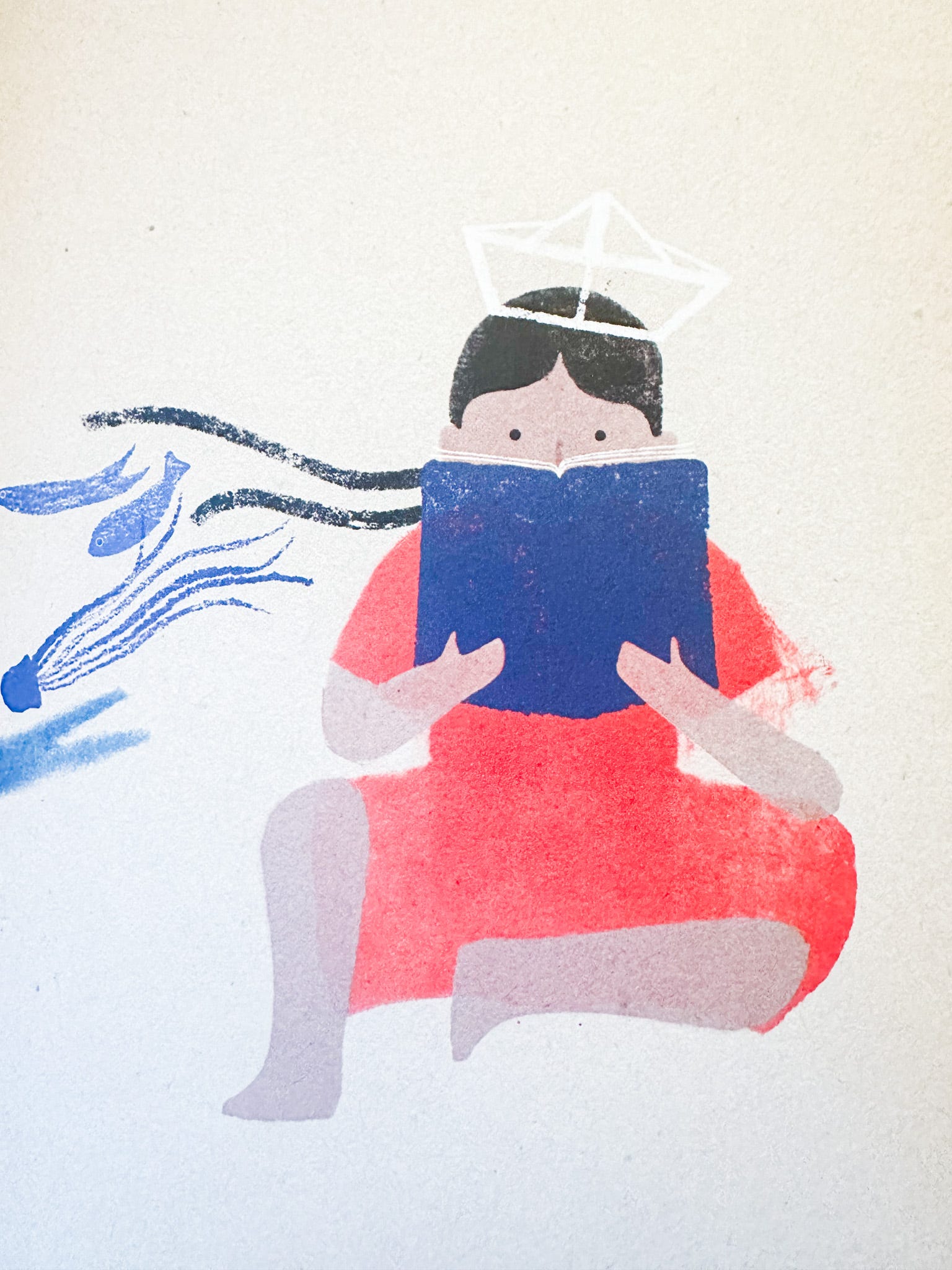
This was done in ink and pencil, and then finished digitally. If I was working in ink, and I smudged the red ink, I would have abandoned the piece or cleaned it up digitally. But look at how charming the smudge around her arm is.
A lot of work in the exhibit had these types of charming imperfections, and it made realized that I can let go a bit in my work. In fact I learned that sometimes the illustrations were more effective when they’re not perfect… A smudge here or there, a speckle of paint, or a straight line that’s actually a bit wiggly. And it’s probably more fun to create this way.
It takes skill to create work with these charming imperfections. None of the work in the show looked messy. Instead, each artist seemed completely confident in their work and medium.
Recently I have been working in a hybrid method of combining traditional and digital media to try to get some of this charm, so I was particularly interested to see artists who were working in a similar way. Many of the artists worked hybrid like me, and others worked completely digitally or completely traditionally. I have listed the medium under each work of art along with the illustrator’s name.
I’ll start by looking at these artists who combine traditional and digital, and then we’ll take a look at artists who worked just traditionally or just digitally.
What I noticed, though, across all of these methods (digital, traditional, or hybrid) is that there was a messiness and looseness in the textures, despite the medium. Textures can look hand painted and organic, whether the work was done traditionally or digitally, as we’ll see below.
So let’s look at some of this beautiful work. I have curated a selection of art from the Illustrator’s Exhibition Winners, and you can see more of the beautiful work here on Winning Illustrator’s page on the BCBF website.
Hybrid: Traditional and Digital
First up let’s look at some work that was created using traditional materials as well as digital techniques. I have written the specific materials as listed in the official catalogue. Take a moment to look at these two pieces. I’ve written some thoughts underneath them.
The gorilla by Alice Bonora is so sweet. This is a style that really speaks to me, so I’m noticing how she used crayons and oil pastels - two materials I haven’t used. I like how the beige of the lamp shade extends past the line of the lamp shade. That’s an example of the charming imperfection that I was writing about above.
In contrast to the softness of Alice Bonora, Reto Crameri created a graphic piece with bold colors and shapes. He gave extra interest to the shapes by painting them with ink and allowing the ink textures to shine. I also love the smudginess of the light blue wash behind the dark blue bricks. The contrast of clean edges with inky textures works really well. I found more illustrations from this book by Crameri here if you’re interested (I could get lost in all these illustrations! I’ve so enjoyed researching each one and the artist who created them!).
Traditional Materials
Next up are six pieces created with traditional materials. Again, I have written the specific materials as listed in the official catalogue. Like before, take some time to scroll through and observe each piece. I’ll share my thoughts after you’ve had a chance to enjoy the art on your own.
So many cool styles, huh? And all of these pieces have charming imperfections since they’re completely traditional! For example, look at the first image with all the picture frames. The horizontal line where the floor and wall meet isn’t exactly a straight line. What I love about this uneven line is how it adds to the age of the house - the structure feels extra creaky and old since the lines aren’t straight. When I work digitally, it’s so tempting to use the straight line feature to make a perfect line, but I love how Aneta Luskiana made everything look more organic. I think it’s hard to do that without it looking messy, so I really admire this piece.
Also I noticed how strong the composition is in each piece. Since the spreads are laid out in such a clear and thoughtful way, the illustrations are all readable when if the coloring style is a bit more organic or loose. That reminds me how important composition is, because sometimes I only think about style in terms of coloring and drawing individual icons. But the composition creates the canvas for showcasing style, and in the pieces above, it’s done so well. No wonder all these artists won a place in the exhibition!
Digital
Just like with the work above, scroll through these five images and take note of your thoughts. I’ll share after.
Don’t some of these look like they were created by scanning in marks from traditional materials? Yet they were listed as completely digital, so these works show how it’s possible to create some of those imperfections and textures digitally. The one directly above by Gwen Millward is just so sweet. Look at the looseness of the little girl’s red clothing. The edges are soft and the grain of the pencil or pastel brush really shines. I would have been so tempted to clean up those edges, but it’s the smudginess that makes this illustration so very sweet.
When I was working only digitally, I sometimes worried that I needed to be making work traditionally to get these textures, but really all I needed to do was find some good brushes. Recently I heard someone discuss how they made a swatch board of all their digital brushes. I do that with my paint colors for my watercolor and gouache sets, and but never thought to do it for my digital brushes. So that’s a homework assignment for myself, and I think it will help me to add more looseness and imperfections into my digital work. Let me know if you have done this or if you want to.
In conclusion: let’s compare traditional + digital
To wrap up, I’ll re-share some of the work, but this time I’ve created galleries with a mix of work that is digital, traditional, and hybrid. You’ll see work that is in somewhat similar styles but created in different ways. In the gallery below, one piece is done digitally but looks like pastels and colored pencil, and another looks like it could be digital but it’s made with alcohol pens. The purpose of saying this is to show that work on an iPad or with traditional materials creates beautiful artwork, and that no matter the medium, these artists have included some of those charming imperfections.
Similarly, the two pieces below are both really inky. One is done with digital ink and the other with real ink. Both have gorgeous inky textures!
Here’s a final group to compare. These all have textures from pastels or colored pencils, and again, some are done digitally, others traditionally, and some with a bit of both.
At the beginning of this newsletter, I told you I wanted to share a big takeaway, and that was how the majority of the art in the exhibition had imperfections.
It takes skill to include charming imperfections. None of this work looks messy. Each stroke is confident, even if it results in a smudge here or there. Especially think about the digital artists - they could easily have erased some of those smudges, but they didn’t. Because smudges look great!
Seeing all this work in Bologna has really inspired me to experiment and play more in my work, especially with textures, smudges, and uneven lines.
So this is a reminder to myself let loose a bit with my art. Nothing has to be perfect. After all, I’m all making art for kids, and kids are way less judgmental about my art than I am about my art.
I hope you’ll feel inspired to experiment, too!
See you next week for the second part of the super chill Surface Pattern Challenge! (Read part 1 here)
- Katie
Upcoming Live Events
Art Gym: Emotions Workshop | Tuesday April 23 at 11 AM EDT
(open to paid subscribers)
Join Adam Ming and me in our fourth Art Gym workout! We have tons of good stuff to share with you about drawing emotions. We’ve already thought of some activities for drawings lots of different emotions! If you’re a paid subscriber, use the button below to sign up:
Illoguild Live | April 22 at 8 AM EST / 1 PM GMT / 8PM MYT / 12 AM AEST.
(open to all subscribers)
Join the guild as we recap our experiences from this year’s Bologna Children’s Book Fair. We’ll share all about what we learned and how the fair went!
All these different examples are so inspiring! I loved going through them :)
I pretty much only know how to make imperfect art, so this was affirming (even tho it was also intimidating since these are soooo beautiful!). I appreciated that you shared the mediums and guided us through each piece.